
· 9 min read
How to Implement Glassmorphism in Web Design (CSS Examples) 2025
Table of Contents
Glassmorphism
Glassmorphism is a design trend that's taking the web by storm. It's characterised by transparency, blur, subtle borders, and a floating appearance. Here's why you should consider using it in your projects.


Glassmorphism: What a Concept!
Let’s face it, folks. In the world of web design, trends come and go faster than a JavaScript framework can say “deprecated”. But every once in a while, a design approach emerges that catches everyone’s eye and makes us pause to appreciate its elegance. This time, it’s glassmorphism.
What is Glassmorphism?
Glassmorphism is a cool design trend that’s all about creating a frosted glass effect in your user interfaces.
Key Characteristics of Glassmorphism:
- Translucency: Objects appear translucent, allowing the background to peek through.
- Blur: Allowing them to replicate the frosted glass effect.
- Subtle border: The elements are outlined with a subtle border to enhance their visibility on the background.
- Floating appearance: They also appear to be lifted off the background, adding depth and dimension to your design.
Why Glassmorphism?
Well, you might say I have a bias towards glassmorphism, after all, I have used it partly in this blog. But here are a few reasons why you might want to consider using it in your projects:
-
It’s visually appealing: Arguably, glassmorphism adds a touch of elegance and sophistication to your interfaces, making them stand out from the crowd.
-
It’s versatile: Whether you’re designing a landing page, a dashboard, or an e-commerce site, glassmorphism can be adapted to suit many contexts.
-
You can do it with CSS: It is really easy to implement, just a few lines of code, and you’re good to go (next section).
-
It’s on-trend: Glassmorphism is gaining popularity in the design community, making it a great way to stay current and give your projects a modern touch.
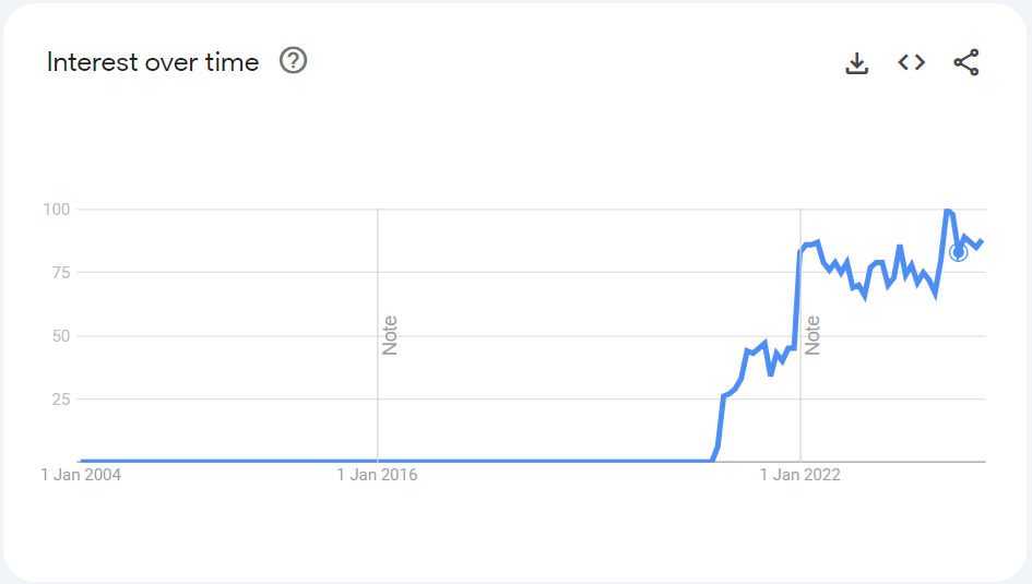
Glassmorphism on Google Trends shows a steady increase in popularity from 2020 to 2024.
Implementing Glassmorphism
Now that you’re sold on the idea, let’s talk about how you can implement it in your projects. The good news? With a few lines of CSS, you can achieve this effect that will make your website look 3278% more modern (actual percentage may vary).
The Basics: How to Create a Glassmorphic Element (CSS)
Here’s a little CSS snippet to get you started on your designs:
.glass-element {
  background: rgba(255, 255, 255, 0.05);
  /* See next section for a proper blur range of values */
  backdrop-filter: blur(10px);
  -webkit-backdrop-filter: blur(10px); /* For Safari, iOS */
  border: 1px solid rgba(255, 255, 255, 0.2);
  box-shadow: 0 8px 32px 0 rgba(0, 0, 0, 0.15);
  border-radius: 1rem;
  padding: 1.5rem;
  z-index: 10; /* Ensure it's above other elements */
  color: whitesmoke;
  /* transform: rotate(-5deg); */ /* Tilted effect */
}
📣 However, when it comes to web design, it’s easy to get caught up in the latest visual trends and just copy-paste some code, but as HCI principles remind us, form should always follow function.
Before diving into these fancy effects, we need to make sure the core functionality of our website is seamless and user-friendly.
Blur, Translucency, and Depth Perception
You might ask yourself: How do I choose the blur value, the right opacity, or the perfect shadow to create a glassmorphic effect that’s both visually appealing and functional?
Let’s draw some insights from some research in perceptual psychology and applying them to HCI design principles.
Quantifying Blur and Translucency
Singh and Anderson (2002) conducted a seminal study on the perception of translucency, revealing that the human visual system uses multiple cues to infer the opacity of translucent surfaces. Their research demonstrates that the perceived transmittance Measurement of the amount of light that passes through the element of a translucent layer is significantly influenced by the degree of blur in the region of transparency. This implies that the more an object is blurred, the more opaque it appears.

Now, imagine you have a frosted glass panel: If you press a brightly colored object close behind it, you can see its colors and shapes more distinctly compared to when it is further away. This occurs because, quoting Singh and Anderson (2002):
“Increasing the distance between a translucent layer and an underlying surface increases the degree of image blur. This, in turn, makes the translucent layer appear less transmissive, even though its intrinsic surface properties have not changed.”
Therefore, in UI design, elements that are visually closer to the background surface or content should have less background blur than the ones in the foreground, allowing more details to be perceived behind them, and thus achieving a more realistic depth effect.

Here is a 20s video I found online that shows how blur and opacity can affect the perceived distance of the elements in the background. You can see that when the pane is closer to the background (in this specific case, the hand), it appears to have less blur, making the details behind it more visible and enhancing the sense of depth:
In glassmorphism, blur isn’t just about depth — it also contributes to the frosted glass effect. While closer objects usually have more blur than those in the background, a minimum level of blur is applied to even the most transparent (distant) elements to maintain a consistent frosted appearance. Let’s see how.
Practical (CSS) Guidelines for Blur and Transparency
Based on the insights from Singh and Anderson’s study, let’s look at some practical adjustments for implementing blur and transparency in CSS.
Blur values
Here’s a balanced approach to the blur values:
| Blur | Distance from Viewer |
|---|---|
| 3px | Furthest |
| 9px | |
| 14px | |
| 17px | |
| 20px | Closest |
Opacity values
And here the opacity values, which have more nuances than the blur.
For white (table below): rgba(255, 255, 255, x), I prefer keeping the opacity between 0.05 to 0.2 for the glassmorphic effect.
If you need to increase contrast, you can opt for higher opacity. For instance, my navigation bar (scroll up if you don’t see it) has an opacity greater than 0.4 and uses different RGB values — rgba(21, 21, 21, 0.436) — than the cards on this page, as it requires more contrast to remain legible over text and images; These have a slightly different visual outcome, so you should adjust the values according to your design needs.
| Opacity | Distance from Viewer |
|---|---|
| 0.05 | Furthest |
| 0.1 | |
| 0.15 | |
| 0.2 | Closest |
You can play with these a bit and try to find the perfect balance for your design.
⭐ Suggestion: Typically, you won’t need more than 2-3 layers of glassmorphic elements, so it’s best to adjust the blur values and maintain the same opacity. On this page, for example, I have used a consistent opacity of 0.05 for all card elements and simply adjusted the blur values to create the depth effect. This method maintains a uniform look while still achieving the desired glassmorphic effect, and without complicating the design.
Accessibility & Usability
In the context of glassmorphism, we need to be mindful of how the translucent, blurred aesthetic impacts the user’s ability to accomplish their primary tasks. While the visual appeal of glassmorphism can certainly enhance the experience, it should never come at the expense of usability and accessibility.
Consider the following:
-
Give an option to disable the effect: Some users may find the frosted glass effect distracting or difficult to read. Providing a toggle or setting to turn off the glassmorphism effects from your platform can improve accessibility for those who prefer a simpler interface. Apple products, for example, have a “Reduce Transparency” option in their accessibility settings to accommodate users with visual impairments.
-
Contrast and readability: Ensure text and interactive elements are legible against the glassy background. Follow WCAG guidelines Web Content Accessibility Guidelines for accessibility, and test your designs with tools like the WebAIM Contrast Checker to ensure readability and usability.

💡Pro Tip: You can preliminarely use the keyboard shortcut
Ctrl + Shift + C on the browser to directly inspect the elements and see whether the contrast is good or not (Chrome dev tools in the picture).
- Hover and focus states: Make sure interactive elements are clearly distinguishable when hovered over or in focus. Use subtle animations or color changes to indicate interactivity. Use the
:hover,:active, and:focusCSS pseudo-classes to style these states, and ensure you are usingcursor: pointerfor clickable elements.
- Aria labels: For screen reader users, provide descriptive
ARIA
Accessible Rich Internet Applications
labels to convey the purpose of interactive elements. This ensures that users who rely on screen readers can navigate and interact with your glassmorphic components effectively. To implement it, you can use the
aria-labelattribute or other ARIA attributes likearia-labelledbyandaria-describedby.
The Future of Glassmorphism
Will glassmorphism stand the test of time, or will it shatter like so many design trends before it? Only time will tell. But one thing’s for sure: it’s got more staying power than the comic sans font you used in your high school PowerPoint presentation.
So, why not give glassmorphism a shot? Your users might thank you, and your website will finally achieve its lifelong dream of becoming a window. Or at least looking like one.
And lastly it is good to remember, whether it’s glassmorphism, or any other design trend, the key is to create interfaces that are not only visually appealing but also accessible, usable, and easy to interact with (more about this might come in a future blog post).
What Do You Think?
I have recently started this blog, and I would love to hear your thoughts on it. If you have any feedback, suggestions, or topics you’d like me to cover, please drop a comment below. Your input helps me shape the content and make it better for everyone.
🦉 Thank you for reading!
References
- Glassmorphic Element CodePen Example (MIT) — By TheDevEnv
- Nielsen Norman Group - Glassmorphism: Definition and Best Practices
- Original Glassmorphism Concept Article by Michal Malewicz
- Singh, M. and Anderson, B.L., 2002. Perceptual assignment of opacity to translucent surfaces: the role of image blur. Perception, 31(5), pp.531-552. [Accessed 17 Aug. 2024].

Francesco Gruosso
Full-Stack Developer, BSc (Hons) Computer Science
Francesco is a software engineer with a passion for building performant and scalable web applications. He has experience working with a variety of technologies and languages, including JavaScript, TypeScript, React, and Node.js. In his free time, he enjoys writing technical articles and learning about new technologies.